top of page


Streamlining the returns process while having a focus on sustainability and community empowerment by minimizing waste
Boosting brand reputation & business collaboration with a new dashboard portal, B2B and non-profit web pages to increase user engagement rates by 14% & usability by 20%
web design | startup | B2B design | CSR & sustainability


Role
UX/UI Designer, Team Lead
Responsibilities
UX/UI Design, User Research, Content Design, Visual Design, Interaction Design, Stakeholder Engagement
Team
Hasan-Ali Abidi (CEO, stakeholder)
Faranak Vaghayenegar (UX/UI Designer)
Chumin Wu (UX/UI Designer)
Interaction Designer (Consulted)
Duration
5 weeks
Impact
Generating a 14% increase in user retention & engagement rates with an overall user satisfaction and usability improvement of 20%.
OVERVIEW
Background
ReturnPal is a Toronto-based courier service company striving to streamline the returns process of online purchases with philanthropic and non-profit services.
With the prospect of expanding ReturnPal's services to partnering businesses, the stakeholder sought to initiate designs for B2B and non-profit web pages that would better highlight the organization's inclusive value proposition while actively addressing sustainability issues in the partnering user experience.
I led the full design of this project and handed off all deliverables with 2 fellow designers to our stakeholder, which resulted in a 14% increase in user retention and engagement rates and an overall 20% improvement in user satisfaction and usability.
Problem
PROBLEM
Businesses don't know what ReturnPal can do for them. They don't even know where to start, meaning limited potential in growth and scalability for the company.
CHALLENGE
Transform ReturnPal from a previously B2C-targeted audience into a dynamic and engaging B2B platform that invites both customers and partnering businesses to explore ReturnPal's services.
Solution
A user and business centered website including both B2B & B2C pages with an innovative dashboard portal feature for partnering businesses.
B2B Integration for Partnering Businesses
Features pages to introduce and present how businesses can seamlessly integrate ReturnPal's services into e-commerce platforms, demonstrating tangible benefits and outcomes while enhancing customer satisfaction and retention.

RESEARCH
Secondary Research (B2B)
Businesses place great efforts in their products, image, and ethics in order to build credibility for consumers.
To kick off, working with B2B features is an unprecedented task for our design team, so I wanted to ensure that we understand what elements can affect business branding and user experience for other businesses. Through our extensive secondary research, we discovered:
Personability of a product (i.e. showing workers’ faces, keeping in touch, tracking), variety, and efficiency are vital to atrract business from consumers.
Businesses with B2B features must typically maintain their customer loyalty, strong and unique brand presence, and management style.
Consumers often seek and appreciate the transparency from companies and how they uphold their societal responsibility.
Secondary Research (CSR)
Large companies benefit greatly from having CSR initiatives.
In addition to researching about B2B services, I audited CSR initiatives from large brands (as shown below) to learn how I can help ReturnPal’s own CSR project. From this discovery, we learned some benefits of having a CSR project:
-
Employee engagement allows for a more positive work environment
-
Enhanced company image & reputation attract clients, customers, and partners
-
Tangible business growth from CSR initiatives can increase revenue

Source: H&M Garment Collecting Program

Source: The North Face Clothes The Loop Program

Source: Patagonia Worn Wear Program
Competitive Analysis
Competitors need better engagement with their services and consumers.
We then analyzed the content and features of 3 different returns courier companies (e.g. ReturnBear, ReturnMates, ReturnQueen). Since ReturnMates was the only one that had both B2C and B2B features like ReturnPal, we considered it a direct competitor.
.png)
ReturnMates (Direct Competitor):
Had great navigational system, minimal UI, services for both customers & businesses (tracking system, B2B start point). Could improve on how to make the user experience more engaged and personalized.
.png)
ReturnBear:
Had structural UI, easy navigational system as well, plenty of CTA elements, displays API documentation available. Targeting specifically to businesses and lacked UI elements, which can dull the user experience.
.png)
ReturnQueen:
Simple UI layout, clear navigational system, provides easy points of contact via social media on "About"section. Targeting specifically to customers, but lacked any form of a tracking system which can present as an issue of trust and credibility for customers.
DESIGN DIRECTION
Design Thinking & Ideation
What are the key features we need to focus on?
As the team lead, I presented and discussed our findings with the CEO and understood our goals and constraints:
-
UI style guide & screens from the previously B2C webpages were mostly finalized
-
B2B pages should provide just enough content for users to contact the company for more information
Additionally, I took initiative and presented the idea of a dashboard portal for ReturnPal’s business partners to show how ReturnPal can appear and operate at a larger scale. Synthesizing everything so far, we identified a few themes to be mindful of moving forward:
Introducing B2B:
Adding a new tab into the current tab system to create a space for businesses to get involved.
Including new feature:
Designing a dashboard portal system to provide partnering businesses with engaging services.
Hightlighting CSR initiative:
Providing more information for users to participate in community & non-profit work.
Working within constraints:
Being mindful of limitations set by stakeholder on present B2C features & design.
User Flow & Site Maps
Organizing our thoughts into a system.
The next step was to formulate a visual representation of the above themes to outline the website's information architecture and navigation. I wanted to:
-
Present our screens as a welcoming, professional, and concise space for partnering businesses
-
Prioritize quick, intuitive access to key information based on client needs
-
Provide a navigable space to encapsulate B2B, CSR, and dashboard portal features

DESIGN
Branding & UI Elements
Getting the stamp of approval.
Despite the stakeholder’s request to limit our influence on the B2C screens, our team proposed some modifications that we felt would benefit ReturnPal, to which the stakeholder was fortunately on board with:
-
Adding more shades to the company color scheme for better visual variety and depth
-
Including a tab to the B2C header and changing the footer to minimize friction and ensure quick access to support for business users

Header, Sign In, & Footer Iterations
Greater inclusivity through a clearer header and footer & an redesigned sign in page.
With more consistent appearances of ReturnPal's B2B services, we emphasized the opportunities that users can have with the brand. Additionally, we ensured that important information would be more easily accessible by including new tabs and pages throughout the website.
.png)
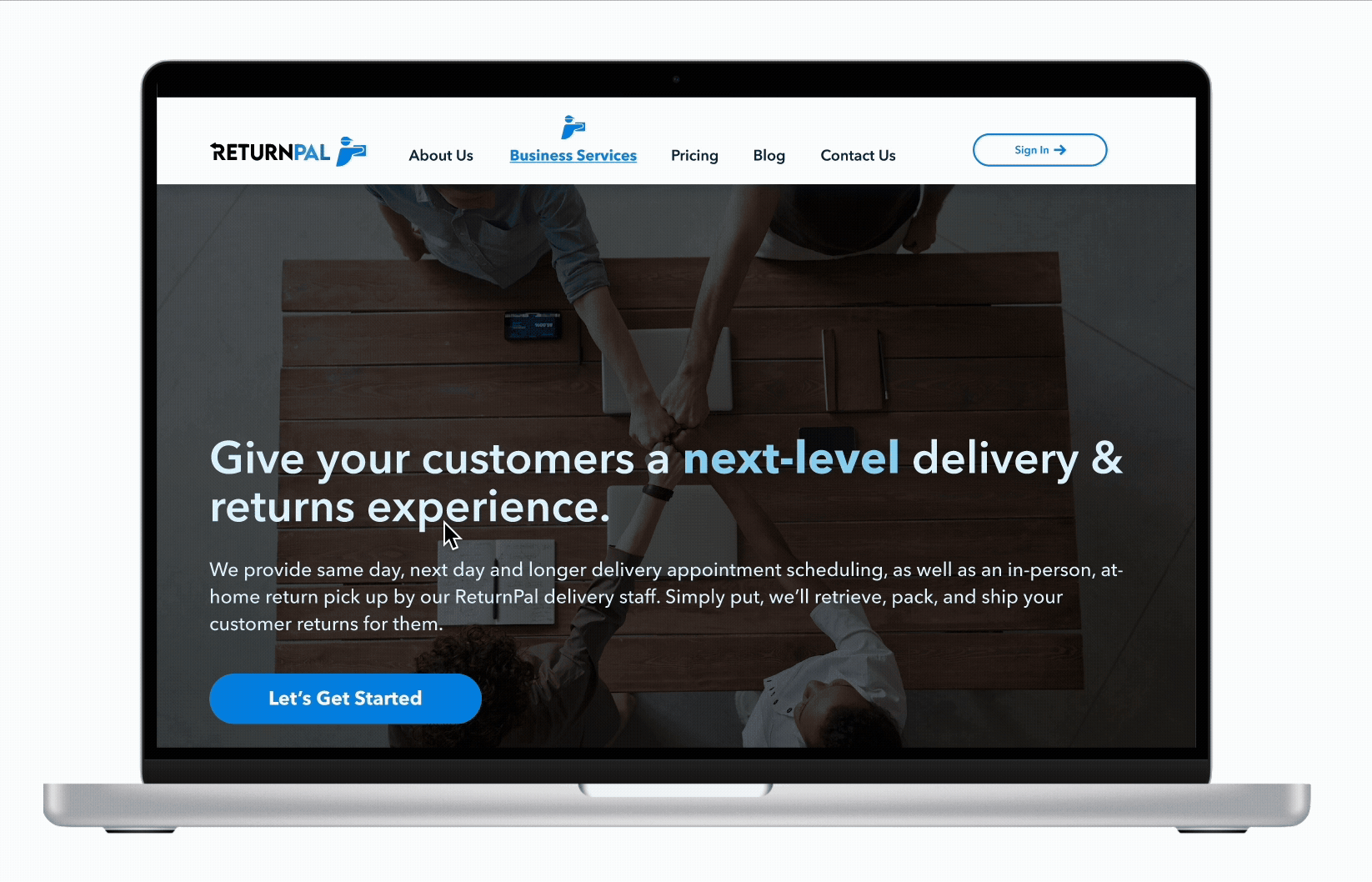
Redesigned top header
Including a tab for potential partnering businesses while making better use of the company icon highlights which page the user is currently on, providing greater visibility of the system status.
TESTING & ITERATIONS
Usability Testing & Iterations
“Straight-forward, easy to navigate.” But also a lot to process.
I first conducted a round of remote, moderated usability testing (n=5, specifically 3 small business owners & 2 regular users) to assess the usability and value proposition of the website. Participants were asked to complete 4 main tasks:
-
Discovering the company’s services and collaboration opportunities
-
Initiating partnering process and requesting donation help
While the website performed well overall, users shared feedback to address the readability, nomenclature, and slight UI inconsistencies in certain screens. After making iterations to refine these pain points, we then performed a second round of usability testing with three more tasks to the previous four to gauge the viability of the newly created dashboard portal feature. Here's what we learned:
.png)
Not every business is a "brand."
3 out of 5 participants felt misled about the tab name "For Brands" because they did not consider themselves as "brands" since they were small business owners.
A more coherent name.
Changing the name of the tab from "For Brands" to "Business Services" gave a more intuitive & better expectation of what businesses can see when they click into it.
RESULTS
Results
Business owners and users alike showed increased interest and ease of use with overall site & dashboard portal pages.
The final iterated website had a strong satisfaction rating, with 100% of participants feeling much more ease navigating and learning about ReturnPal's B2B and non-profit work. Users also complimented the presence of a dashboard portal to help main and track their business data, reinforcing its potential to fulfill ReturnPal's mission and vision to streamline the returns process for all.
"Very simple and direct, intuitive layout and easy on the eyes... Overall it has good strategy to rope in business."
- Usability Test Participant 3
14%
Increase in user engagement & retention*
20%
Increase in overall usability & user satisfaction*
*Based on comparison between both rounds of usability testing
REFLECTIONS & NEXT STEPS
Final Thoughts & Takeaways
Understanding how to work with real clients.
Adapt to collaborate:
Working with ReturnPal was such a rewarding experience since I was able to collaborate with a wonderful team from diverse backgrounds and knowledge. After adjusting our work styles at the start, we understood which roles fit us best and worked seamlessly with each other.
Communicate, communicate, communicate:
There was some confusion between us and the stakeholder about the project vision earlier in the process. After reaching out and communicating with the stakeholder, we were able to realign our goals. It feels great to hear the CEO’s high satisfaction with our final deliverable, despite this blip in our progress.
Always learning:
As the team lead for this project, I feel ecstatic to be able to contribute and solve real-world, practical issues for a client company. The challenges that I overcame in this project taught me how to be a more versatile designer, communicator, and colleague for my future projects.
Next Steps For Future Projects
Forseeing the journey.
More usability testing with business owners:
Due to the circumstances of our project, we were only able to perform usability testing with just a handful of business owner users. More usability testing with business owners would give us greater insight to see if our product can truly address the majority of user needs and wants.
More Iterative Design:
Considering how the dashboard portal is an innovative undertaking initiated by our team, I feel that including more iterative design practices like A/B testing could help determine the type of user interface that business users would like to see for their portal pages.
bottom of page